This blog post is going to talk about the storm surge
that swept along the east coast of the UK on the 5th December 2013,
last week. Rather ironically, I was going to post about problems in predicting
disasters and how we mitigate against these, but this seems more topical and
worthy of a post., and I hope to give you a bit of an insight into how a GEES researcher responds to live events relevant to their field.
The surge seemed to catch everyone by surprise. I checked
the forecast on the Monday as my in-laws were travelling to Hull from London to visit
us on the 5th, and the Met Office app suggested Thursday was going
to be quite nice, but a bit windy in the far North-East. The forecast did
evolve over the week, but not so much to suggest the conditions that resulted
in them passing at least five overturned lorries on their journey (two and a
van on the Ouse bridge alone).
On Thursday afternoon, there were warnings of a storm
surge – a temporary increase of sea level caused by low pressure and high
winds – that would potentially flood coastal towns on the east coast. Our local
news focussed on Grimsby and Cleethorpes as being the most likely to be hard
hit. Hull was just at medium risk. Myself and Prof Coulthard (my boss) watched the tide
rise on the Immingham tidal gauge and compared it to the data we held from the
same site during the 1953 storm surge.
The 1953 storm is THE storm when talking about storm
surges in the UK. It was big and it caused extensive damage and over 300 people
lost their lives. This storm was being billed as ‘the worst since 1953’, yet to
our astonishment we saw the tidal gauge go up and look increasingly like it was
going to exceed the level recorded back then.
As we were leaving the office, around five thirty, the
first warnings started coming in that Victoria Dock in Hull was at risk. I
followed the story unfold on Twitter as photos popped up showing the first
signs of water overtopping the defences. The Marina also flooded and water
spilled out into the Kingston Retail Park, and the home of the Hull Stingrays
and Hull’s most versatile venue, the Ice Arena.


Flooding between the Marine and Kingston Retail Park in Hull Photo by @estuary_ecology
The City of Hull held its breath as high tide approached.
Only the tidal barrier stood between the surging sea and thousands of
properties in the flood plain of the River Hull behind. The tide crept ever
upwards, lapping at the sides of the mighty barrier but could not overcome it.
But it was close – only 40cm remained of that barrier, built to defend
the city after the1953 surge. It had done its job, just. The tide height of 5.8m is a record high for Hull.


The Saviour of Hull! - The Tidal Barrier holds back the tide. Photo by @Tom_Coulthard (This is just one of many great photos).
The sea water eventually receded at Hull. High tide was later in the inner estuary and badly flooded South Ferriby and Goole. The flooding continued
further south, in Skegness and Boston. Another great tidal barrier, the Thames,
was also needed to save large areas of East London.
Now that the waters have passed the data is beginning to
be collected and analysed. What seemed to take everyone by surprise was the
scale of it. Data from the Immingham gauge stopped when the level reached 8.5m*,
but from the curve it looks like it would have continued to around 9.5m – 2m above the
predicted astronomical tide (from the pull of the Sun and Moon), and over a
metre greater than the highest reading from the 1953 storm surge (at 8.4m).
*I don't know why the gauge stopped, most of them did before high tide that night. My guess is that they either reached the top of their scale, or exceeded a threshold where it is assume too high to be accurate - The Immingham gauge stopped at around the maximum of the 1953 tide level.
*I don't know why the gauge stopped, most of them did before high tide that night. My guess is that they either reached the top of their scale, or exceeded a threshold where it is assume too high to be accurate - The Immingham gauge stopped at around the maximum of the 1953 tide level.
This is very significant. I don’t think anyone
anticipated it. As I said previously, 1953 was THE storm. For the last few
months I have been working on a computer model to simulate the flows in the
Humber, with one of the aims to be able to predict the estuary’s response to
1953-like events, especially in the face of rising sea levels. Much of the
Humber’s defences were built after the 1953 surge so unsurprisingly the model
showed they coped well. Our hypothesis was that the rising sea levels on top of
that might cause them some issues, so we wanted to try and model that.
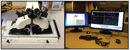
Naturally, first chance on Friday we ran our model with
the tidal heights recorded on the evening before. Our model suggests that if we
had been able to predict the scale of the surge we could have anticipated the
flooding, even just based on this preliminary data (although a large pinch of salt is needed when interpreting the simulation below).
As bad as the flooding was, it has to be said that our
infrastructure did a fantastic job. The scale of this surge was unprecedented,
quite a bit bigger than 1953, yet there has not been the devastation, and
thankfully, the loss of life that followed that storm. If it were not for
structures like the Hull Tidal Barrier, it would have been much, much worse.
And that leaves us with a warning. The International Panel for Climate Change (IPCC), uses different models to try and predict future sea level rises for the next 100years, and the 'Best Case Scenario' - where greenhouse gas emmissions are cut immediately - would likely cause a sea level rise of 40cm. This is the capacity left over on the Hull Tidal Barrier. When we consider that an increase of 60-80cm is probably a better estimate, the ability of our infrastructure to manage this size of event in the future needs to be considered. It maybe
that this storm surge is an event that won't be repeated in our lifetimes,
but it now stands as THE storm we’ll be using the measure future resilience and
it pushed us right to the edge.